Client
Garden City Homes
Project
Creating a stand-out development brand
From the seed of an idea
Garden City Homes was developing some great looking new homes, for sale and shared ownership, and wanted to grab the attention of homebuyers.
We know that a good logo must be distinctive and memorable, but it also needs to reflect the values of the brand it represents.
Quality and aspiration: these are words that sum up Garden City Homes as it delivers flagship developments in what is renowned to be the greenest part of Manchester.
We took their brief and our creative team made it flourish.
A great logo bloomed
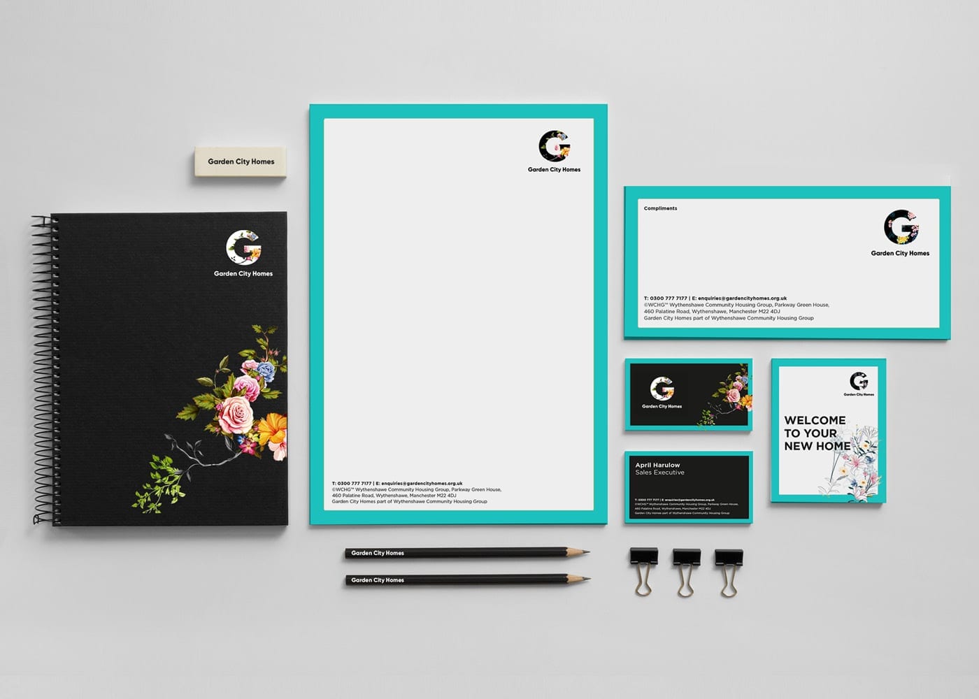
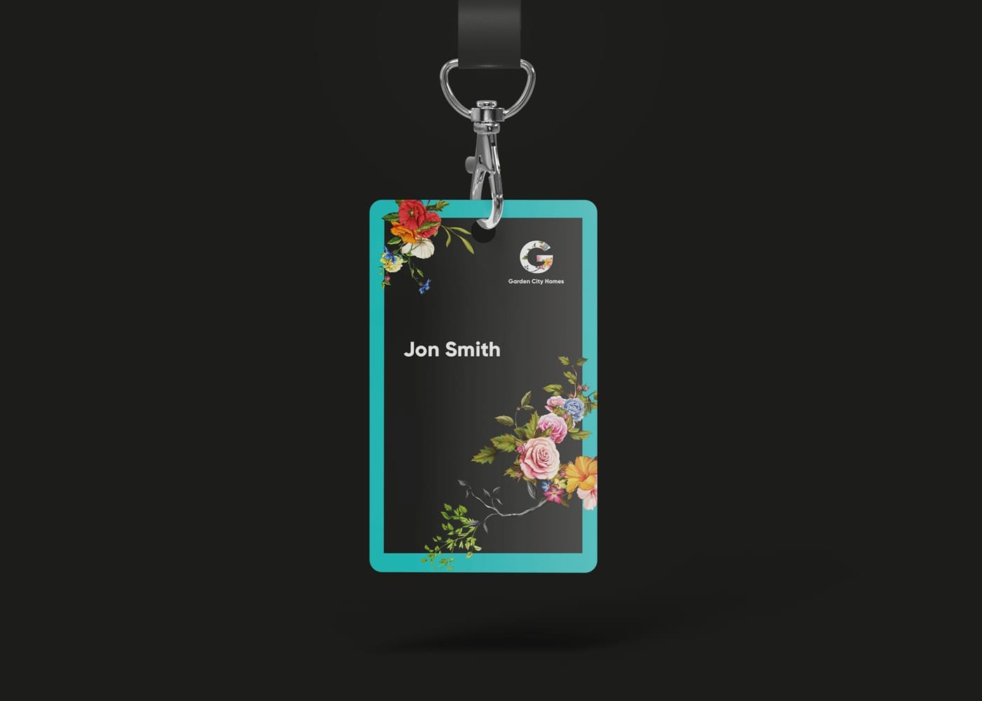
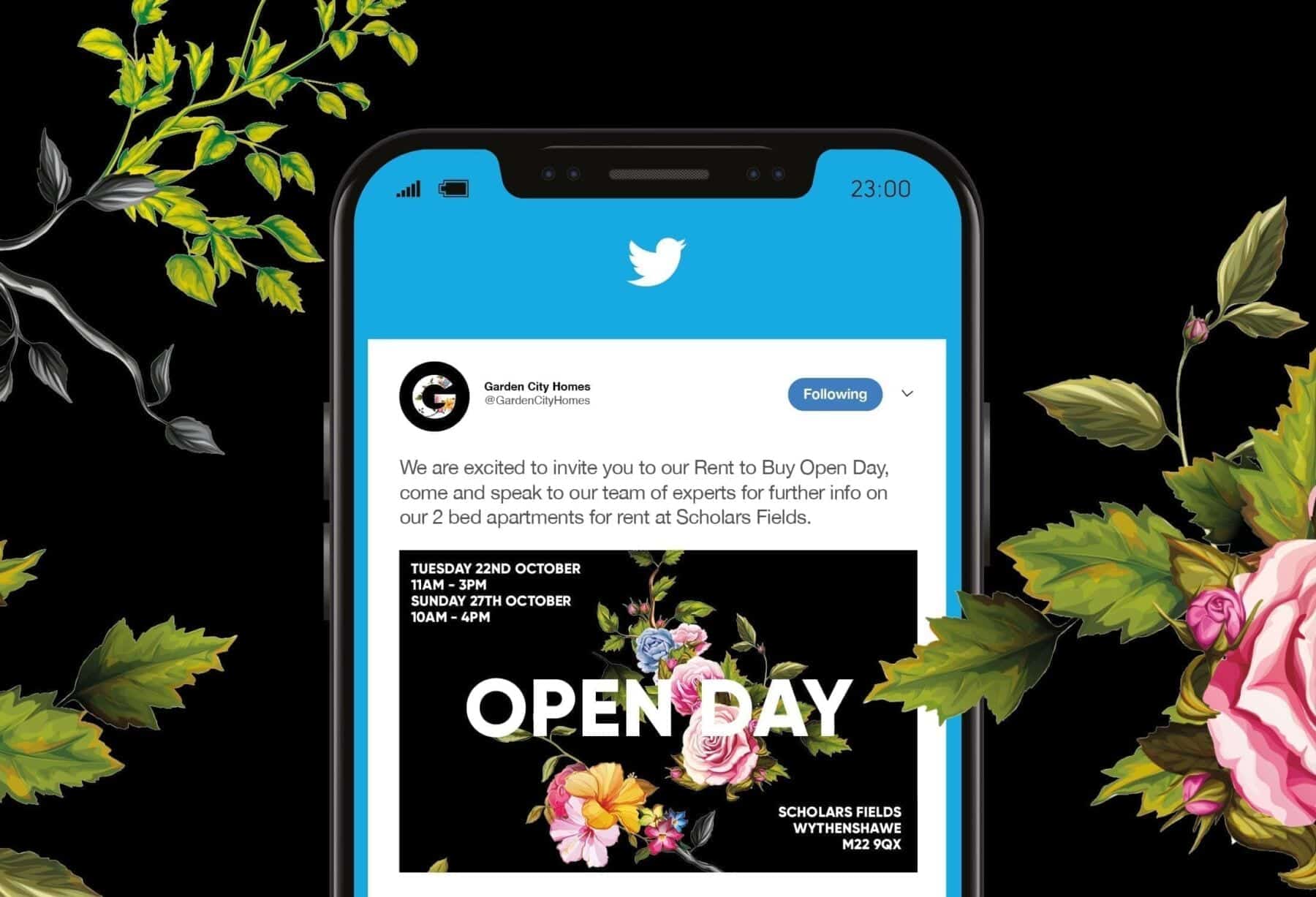
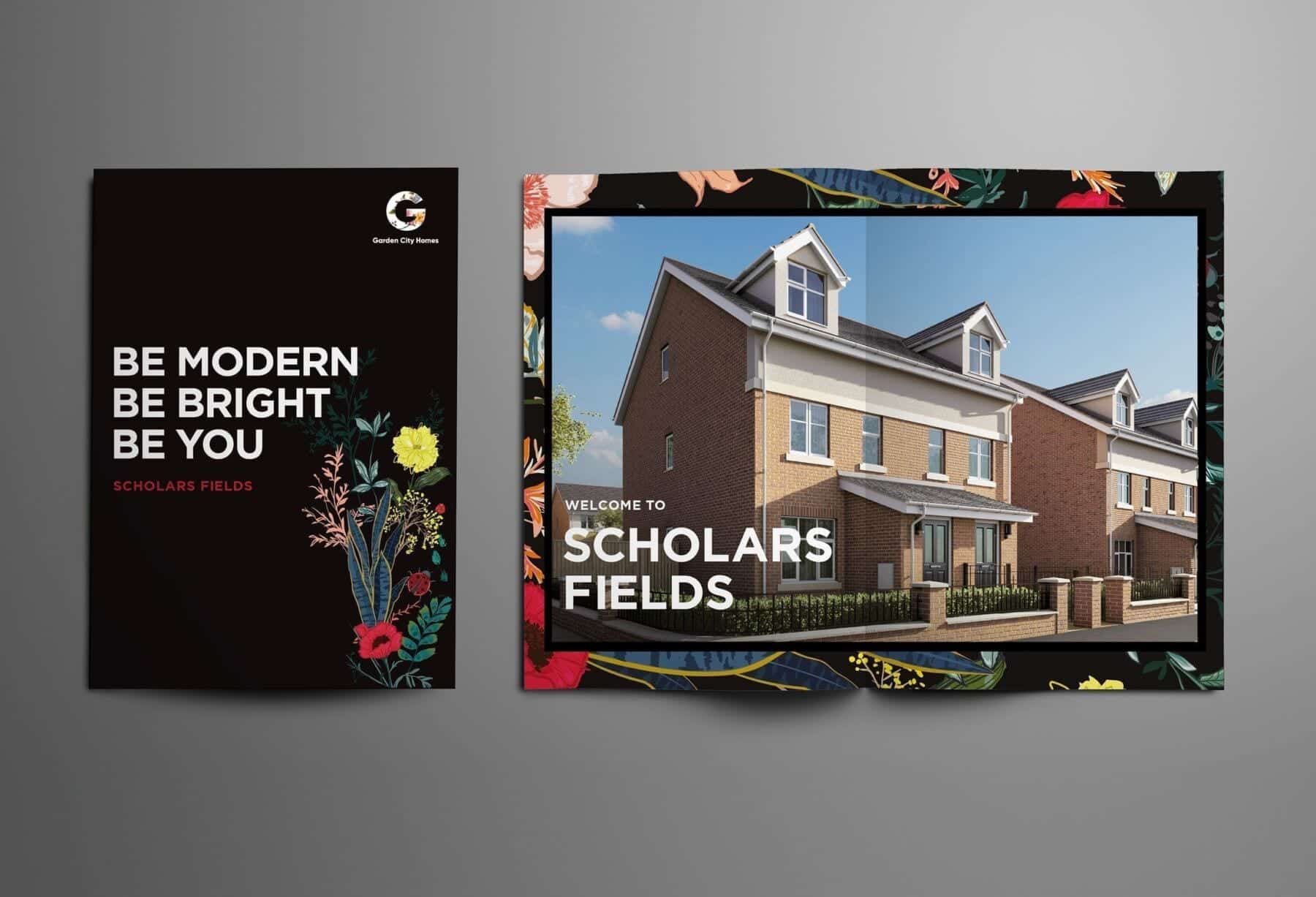
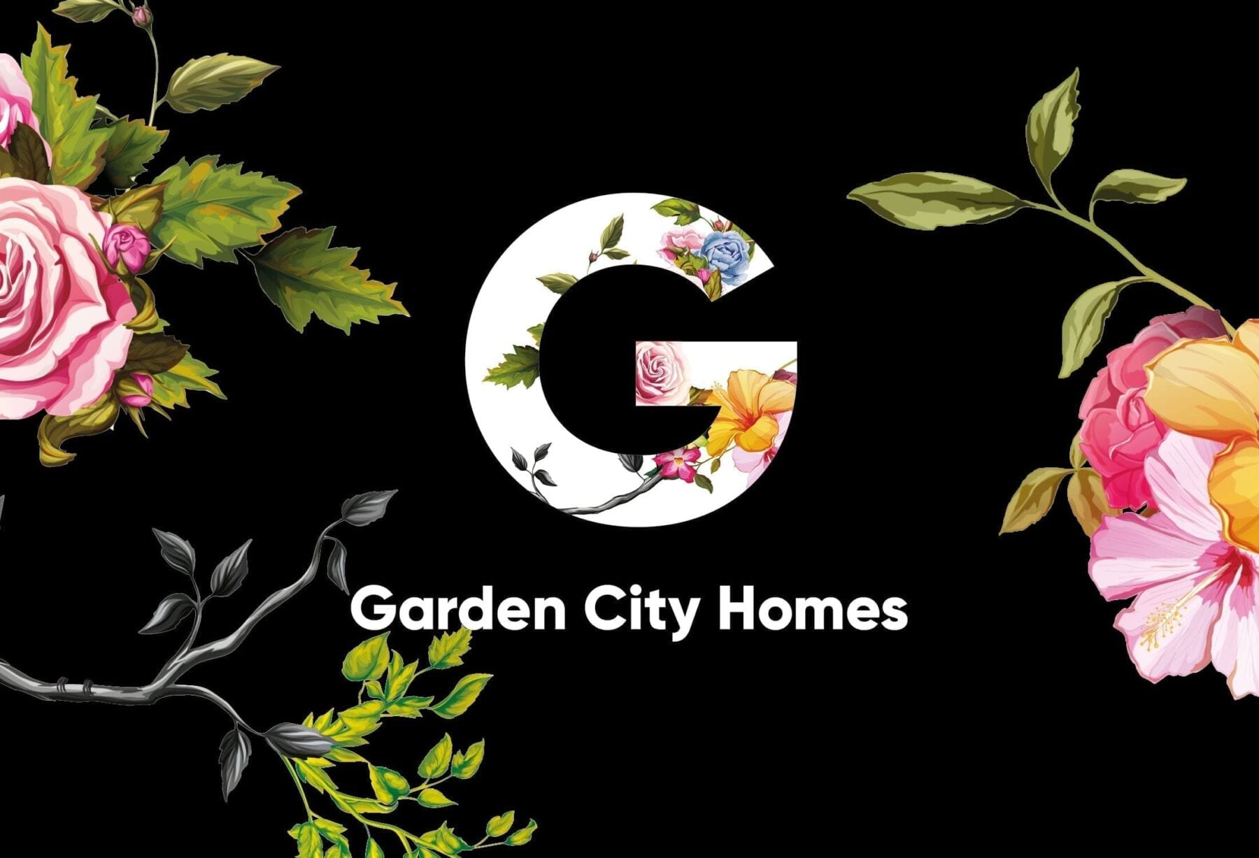
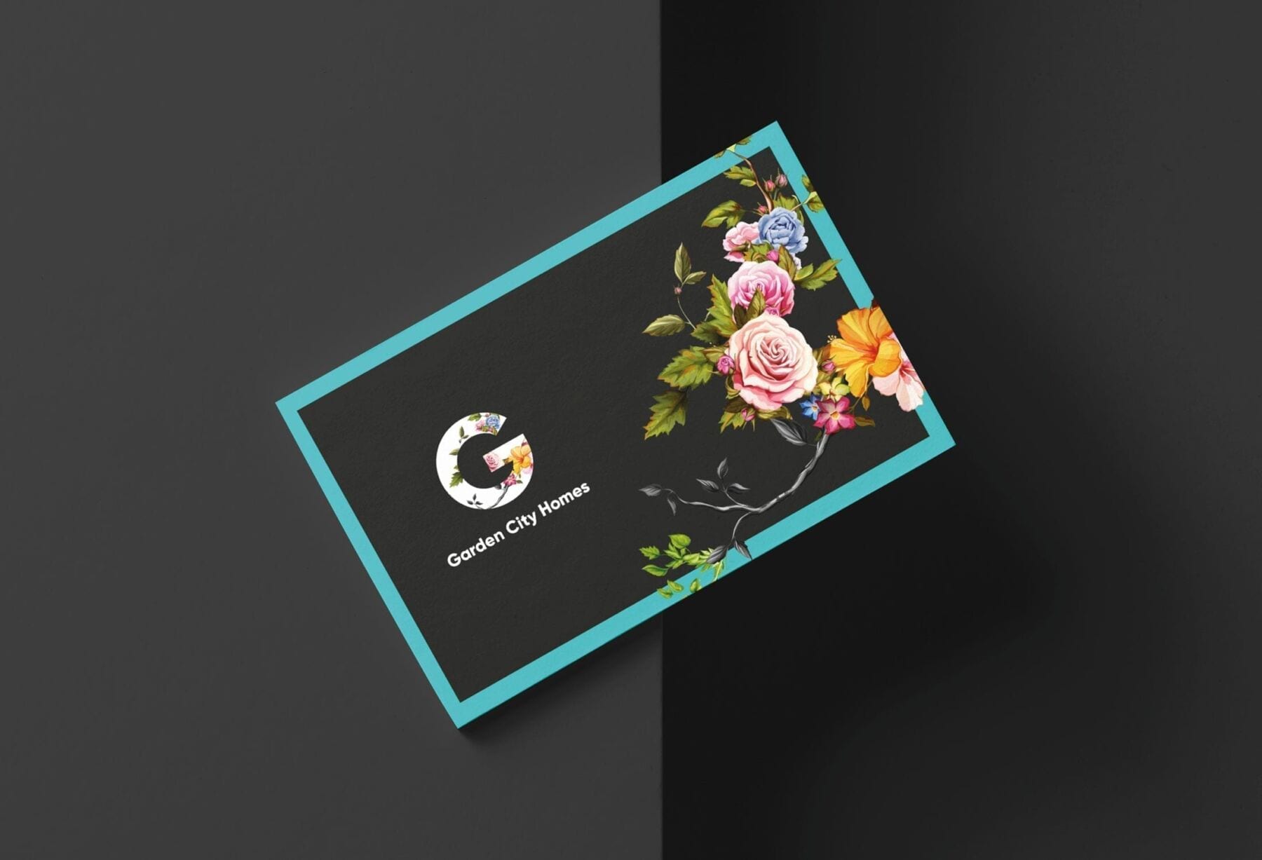
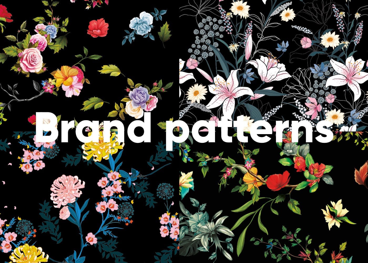
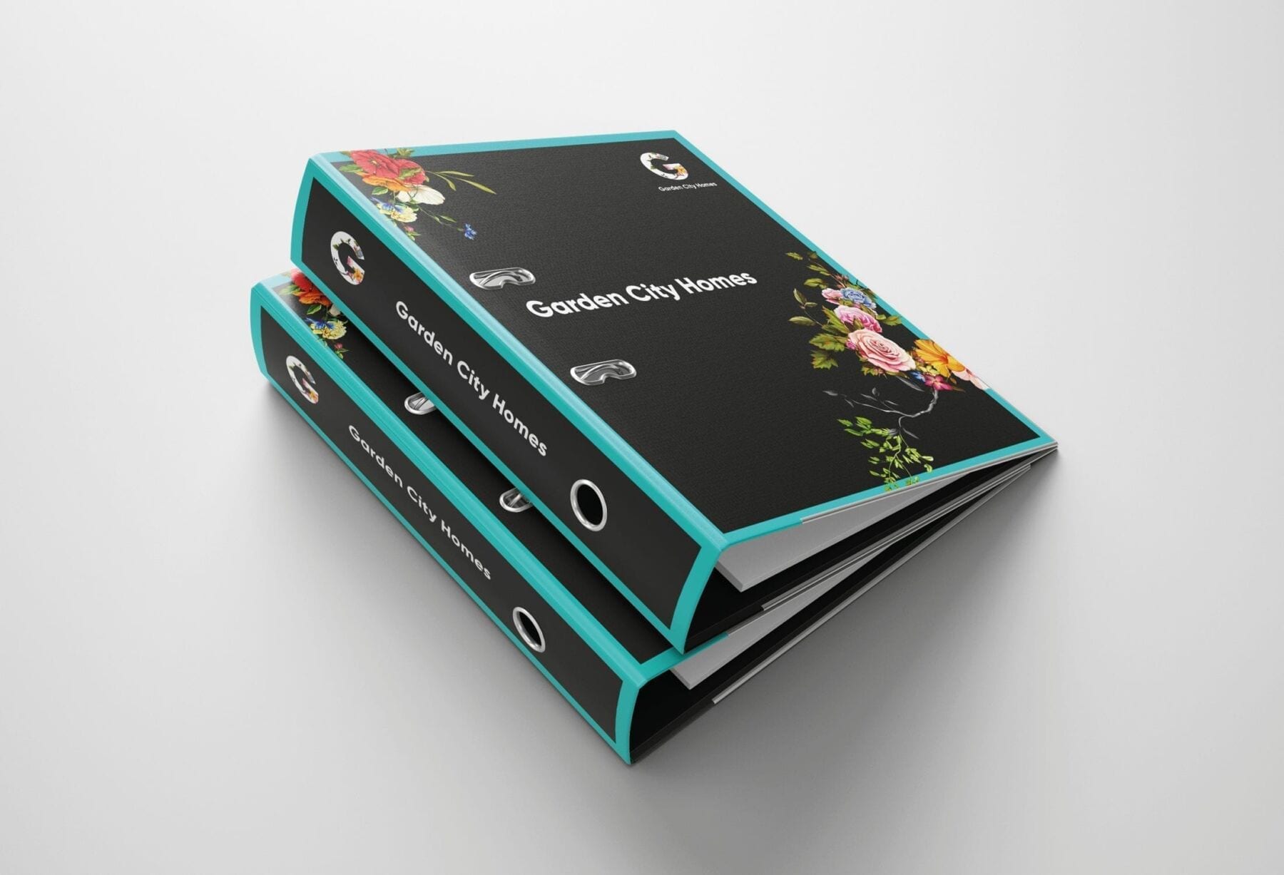
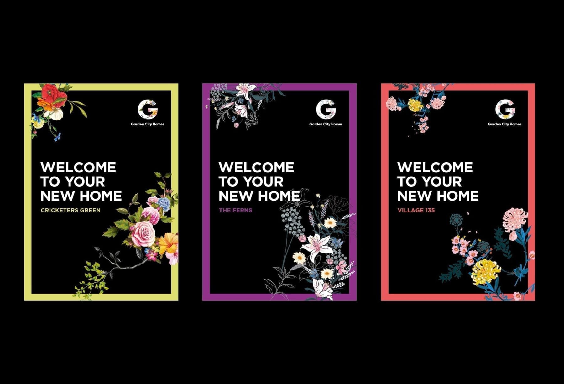
Solid black created a bold and distinctive backdrop to our confident and vibrant floral artwork.
We challenged thinking, played with colour palettes and decided to go big.
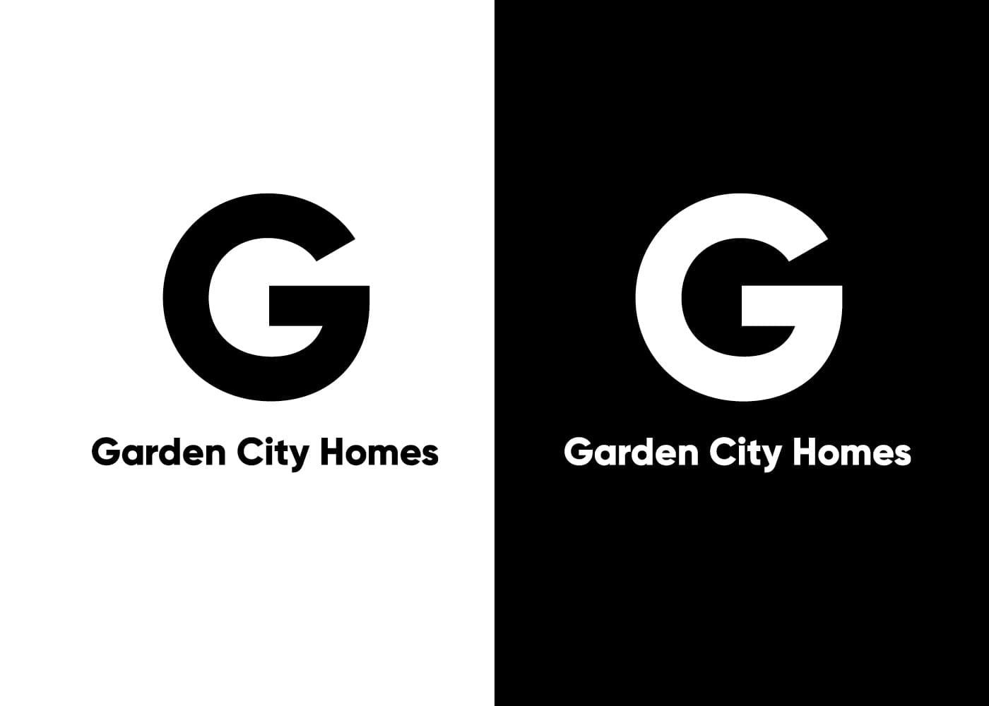
The capital G conveys confidence. The floral designs are homely and celebrate green Wythenshawe.
Above all else, the look is distinctive and memorable, exactly what Garden City Homes needed to set it apart from its sister social housing organisation and all the other housing developers in the north west.
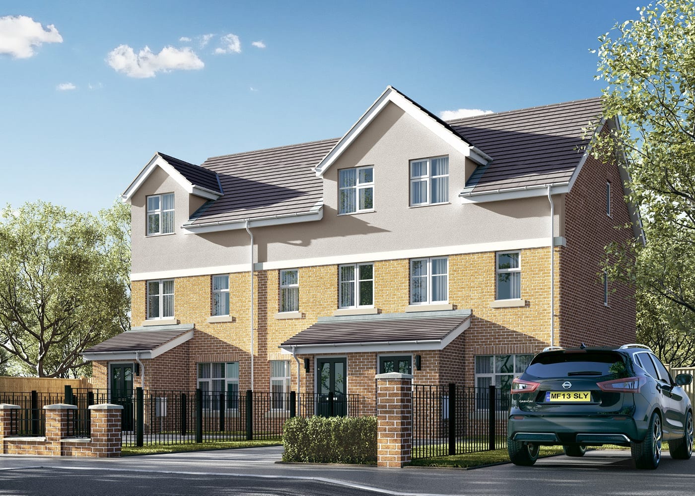
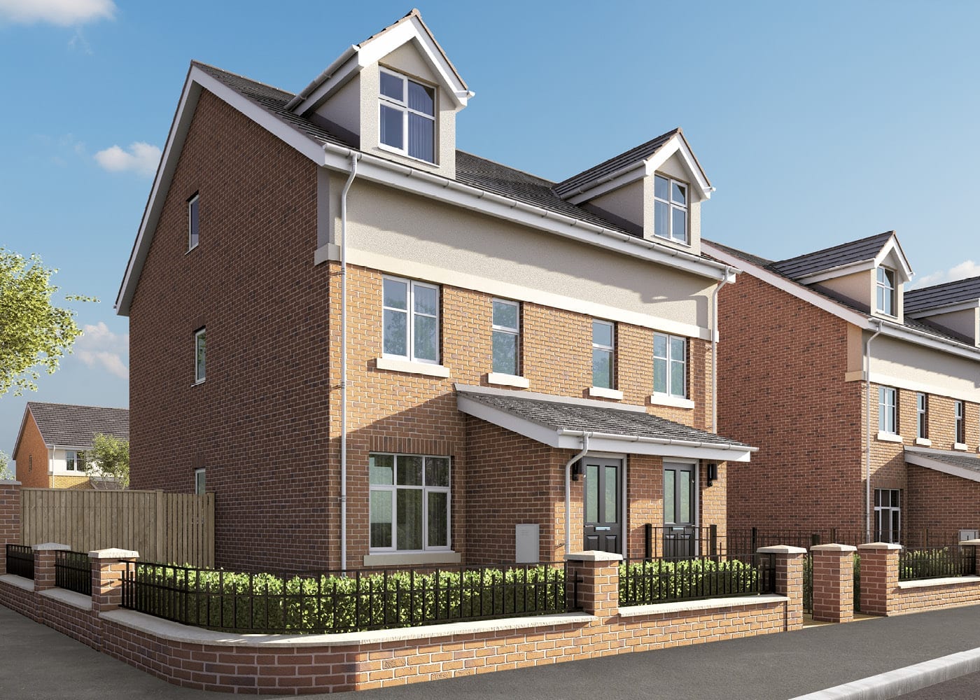
It was great to see the new brand turn heads at the launch of the flagship 147-home Scholars Field housing development.


Flexible friends
Great designs are one thing, but we know that they must flex to be used in different ways.
We also know budgets are often stretched and sometimes a simple, in-house marketing solution is what is needed.
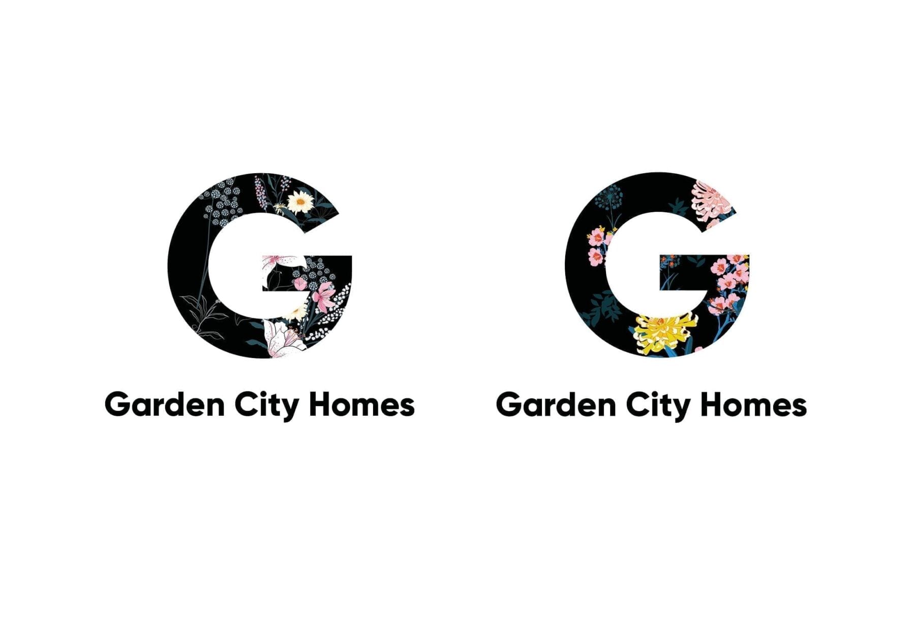
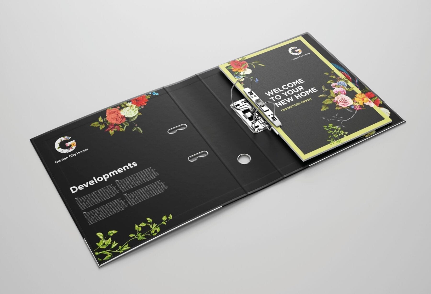
So, we delivered variations of the brand – all immediately recognisable and consistent – but with different applications in mind.
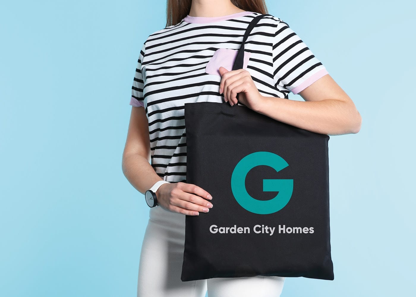
A single spot colour logo for more cost-effective printing.
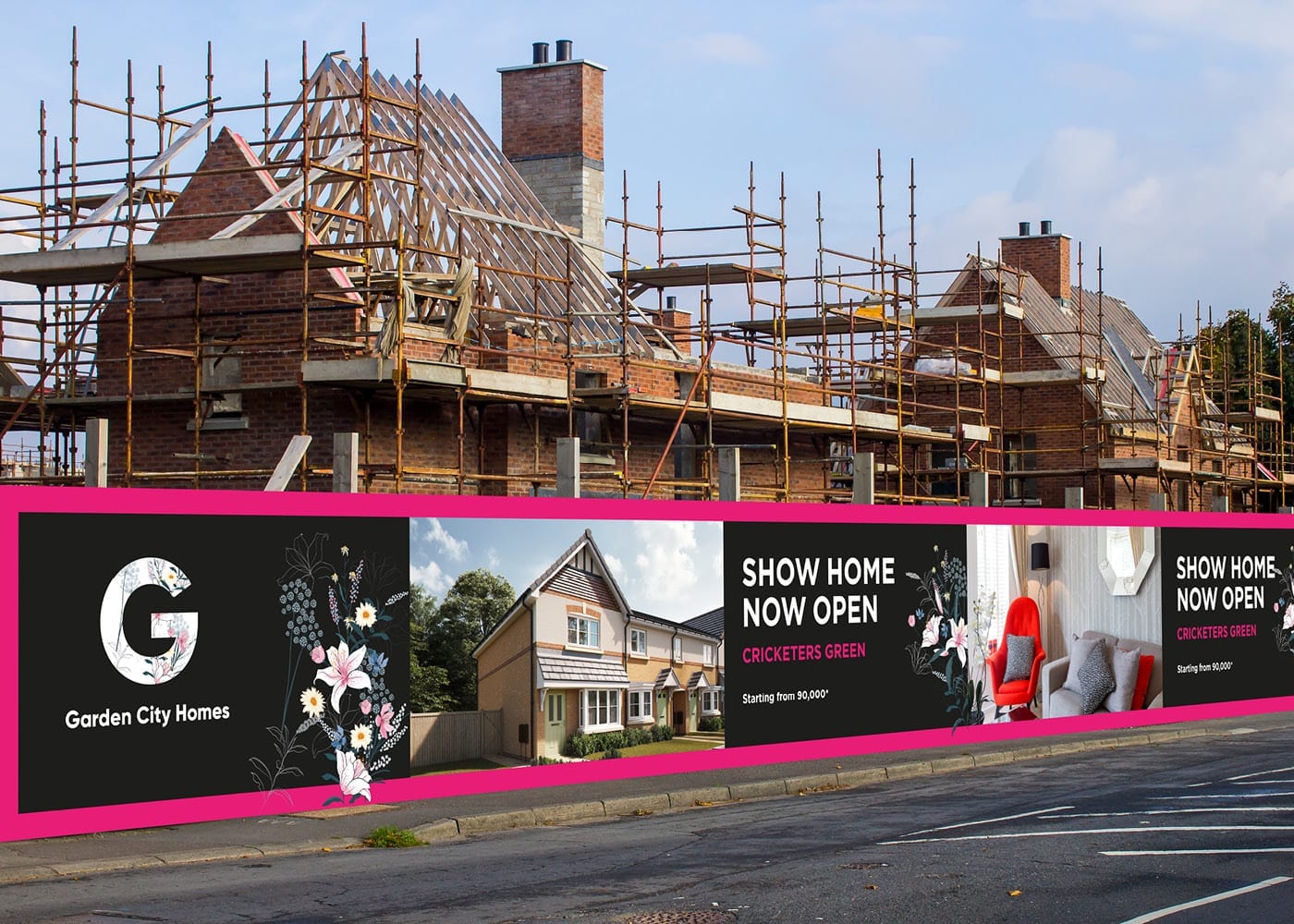
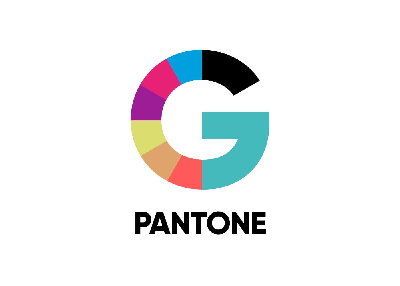
A varied colour palette to choose from, to distinguish one development from another.
And a combination of floral designs to keep the look fresh and adaptable.