Client
Tpas
Project
Creating a new-look brand and website

When ideas align
There’s no doubt Tpas are experts in engagement but a conversation with the chief executive confirmed that their vision, and their brand, were heading in different directions.
It was clear they needed a brand which amplified their influence and expertise. One which would bring new members on board and truly reflect their ambitions for growth.
They also needed a platform from which to drive their work – a website which would give unrivalled benefits to its members.


It’s good to listen
We understand social housing; after all, we are part of the sector.
So, we kicked off the rebranding project by consulting our strong network of housing clients to find out the true value of Tpas.
It was clear Tpas is so much more than a friend to tenants. It is a key influencer and driver for positive change in social housing standards across the UK. What they say, matters.
Our challenge was to develop a brand that could carry such a potential power player.


Being seen, and heard
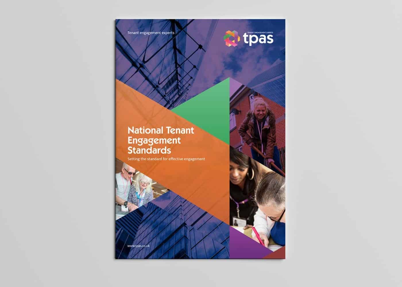
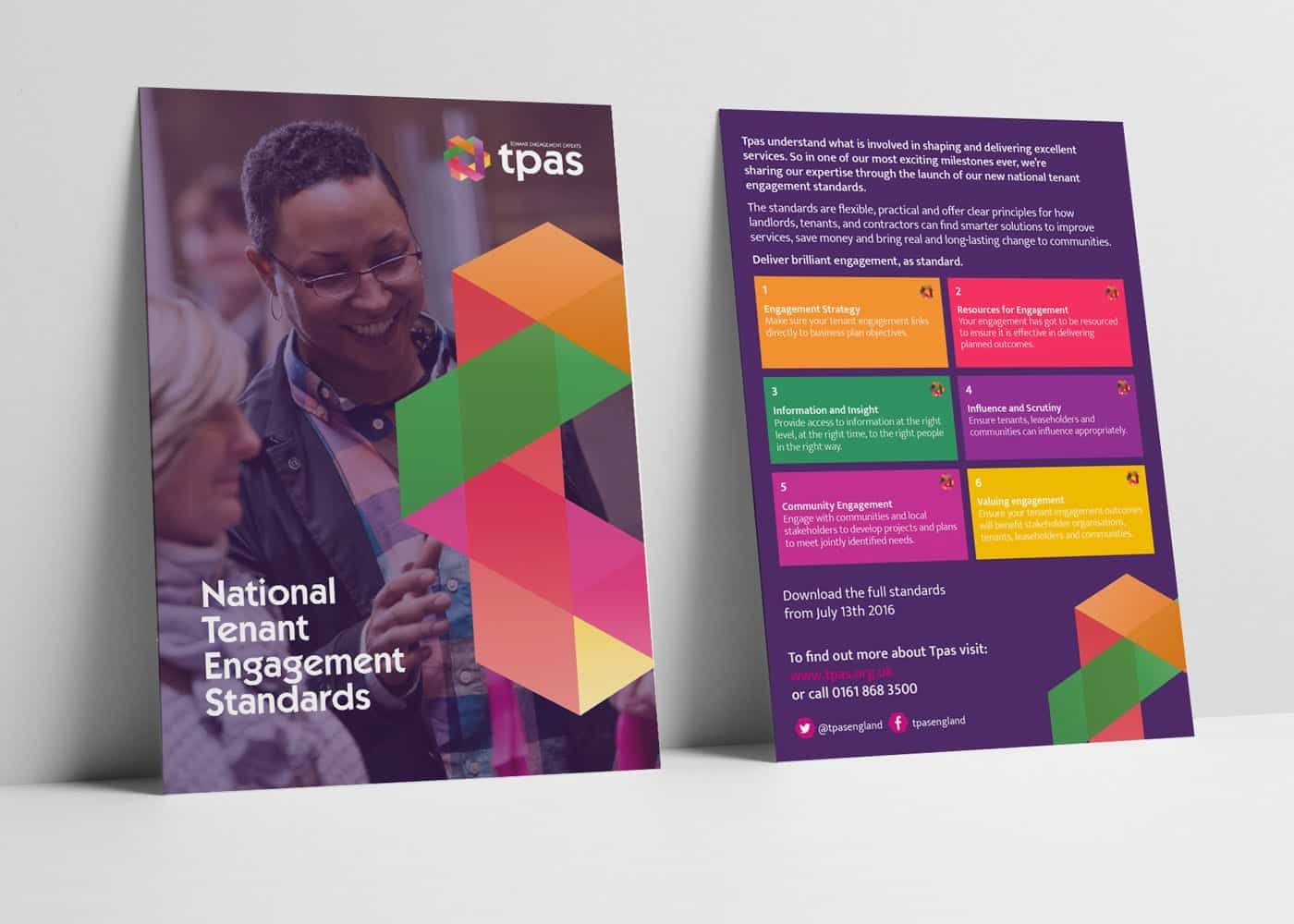
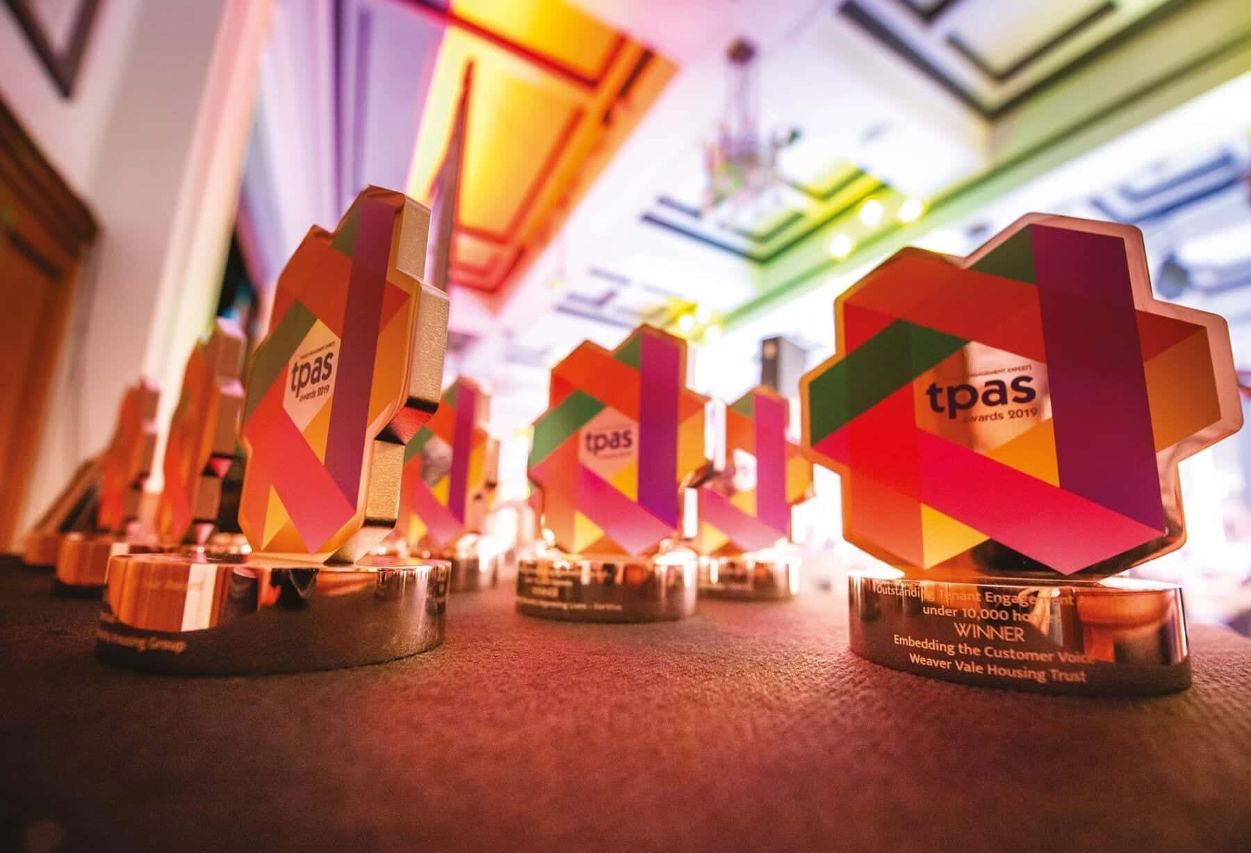
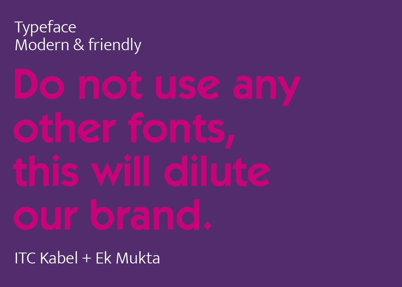
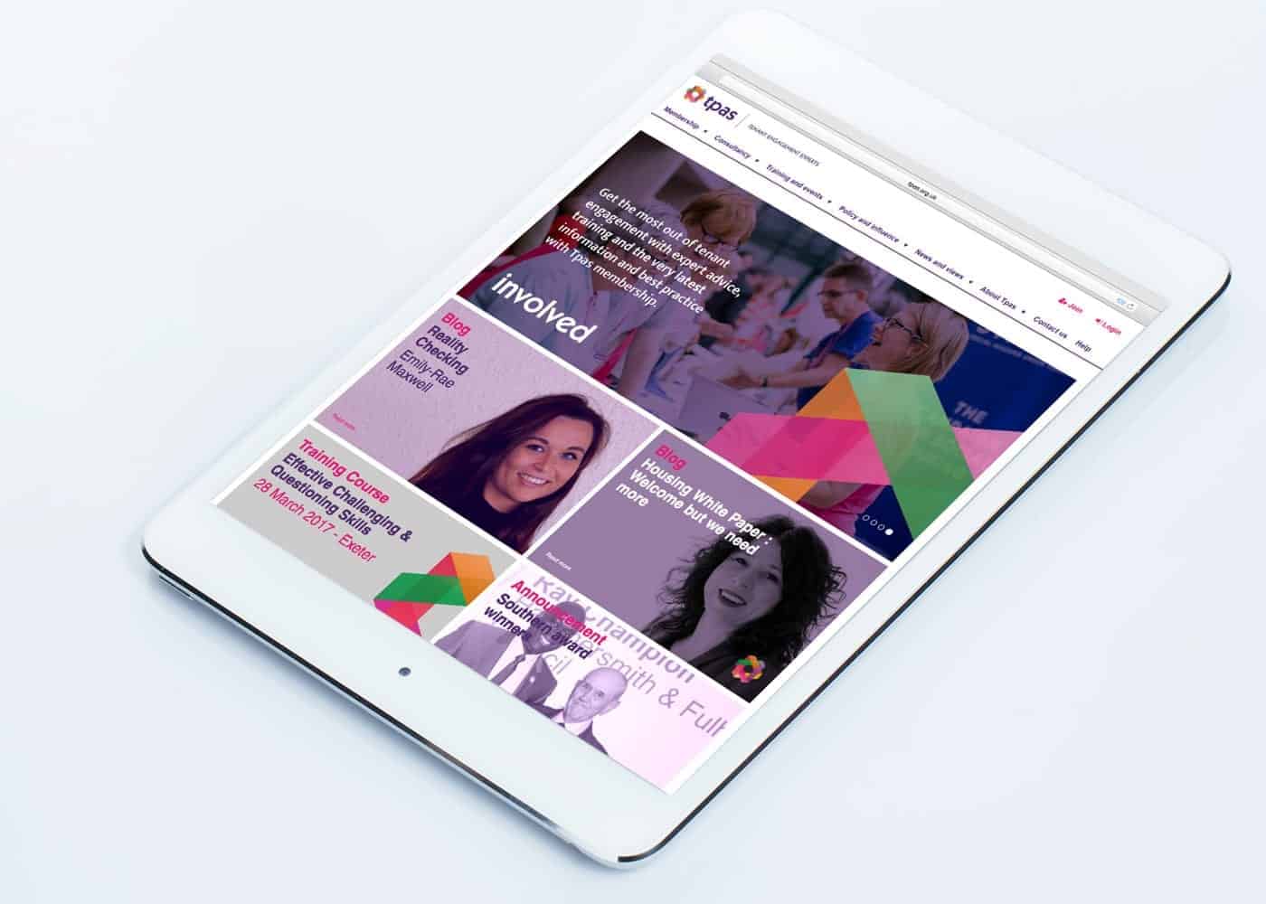
Our creative team did what they do best. They took the essence and ideas of an organisation and created a strong, modern visual image designed to stand the test of time.
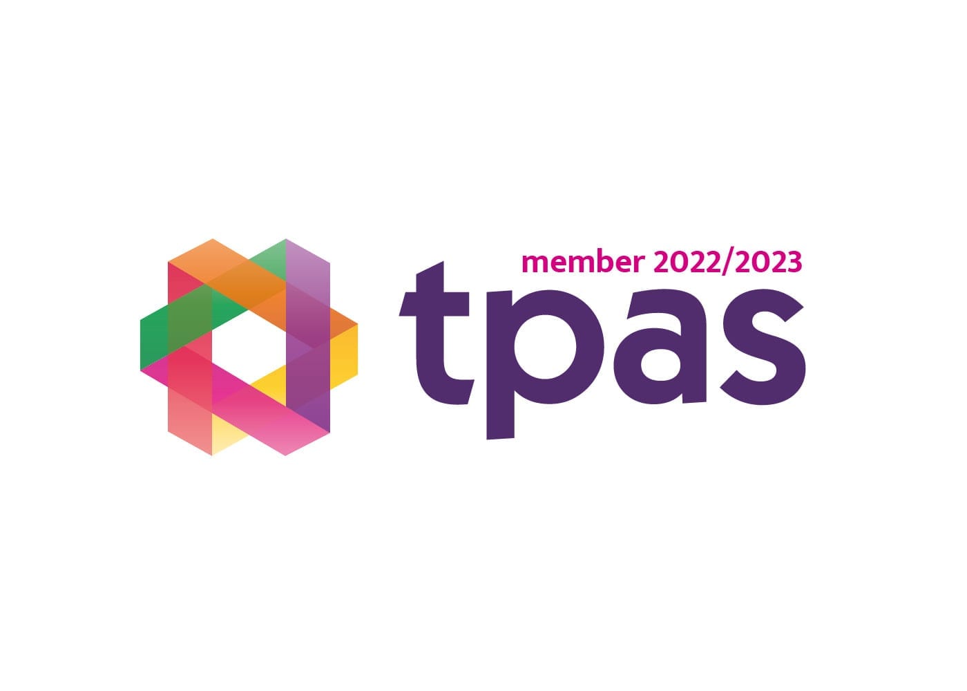
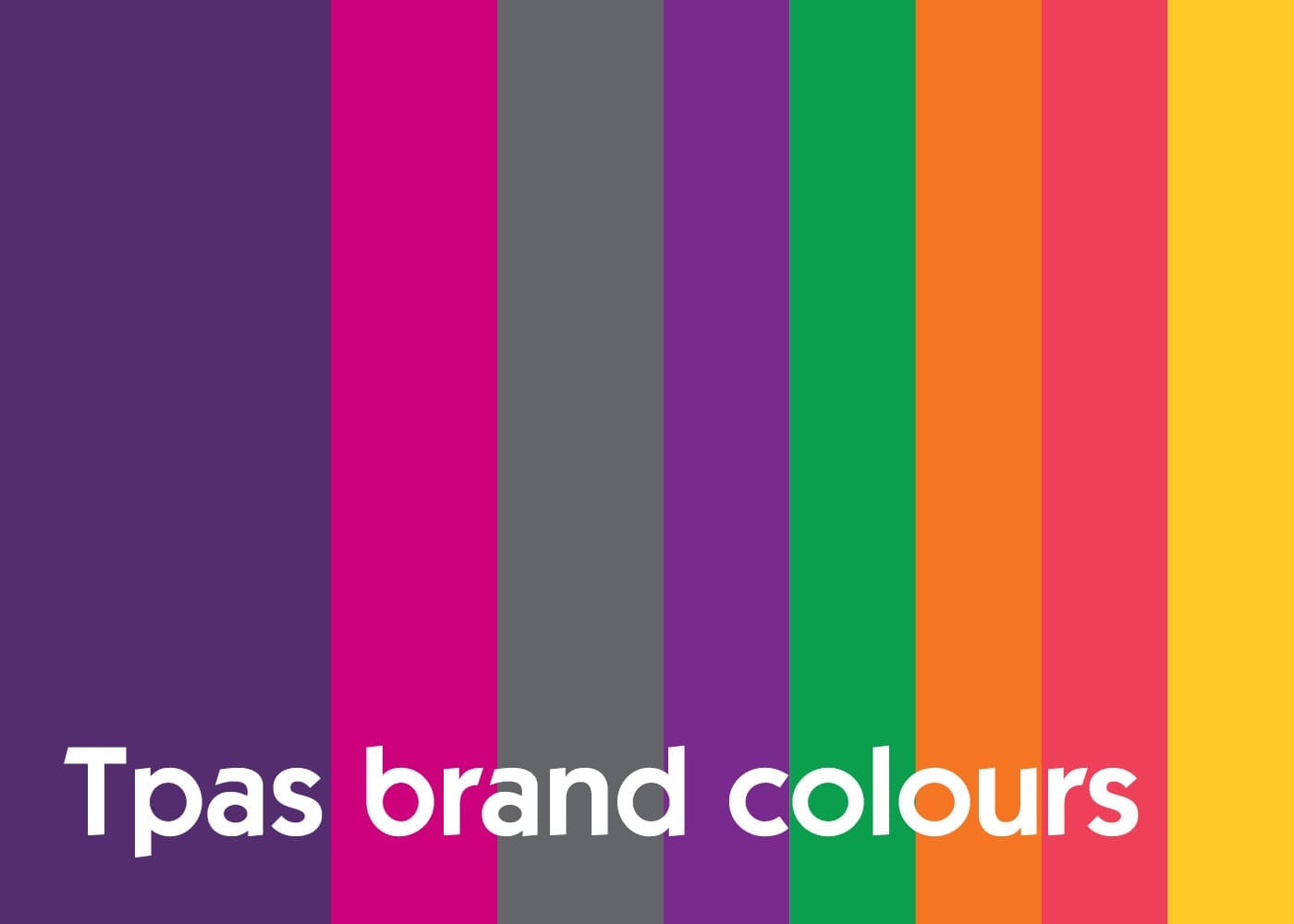
The colour palette sets it apart and yet has universal appeal. And the logo has the subtle suggestion of linking tenants and landlords together to create one strong structure – exactly what Tpas stands for.



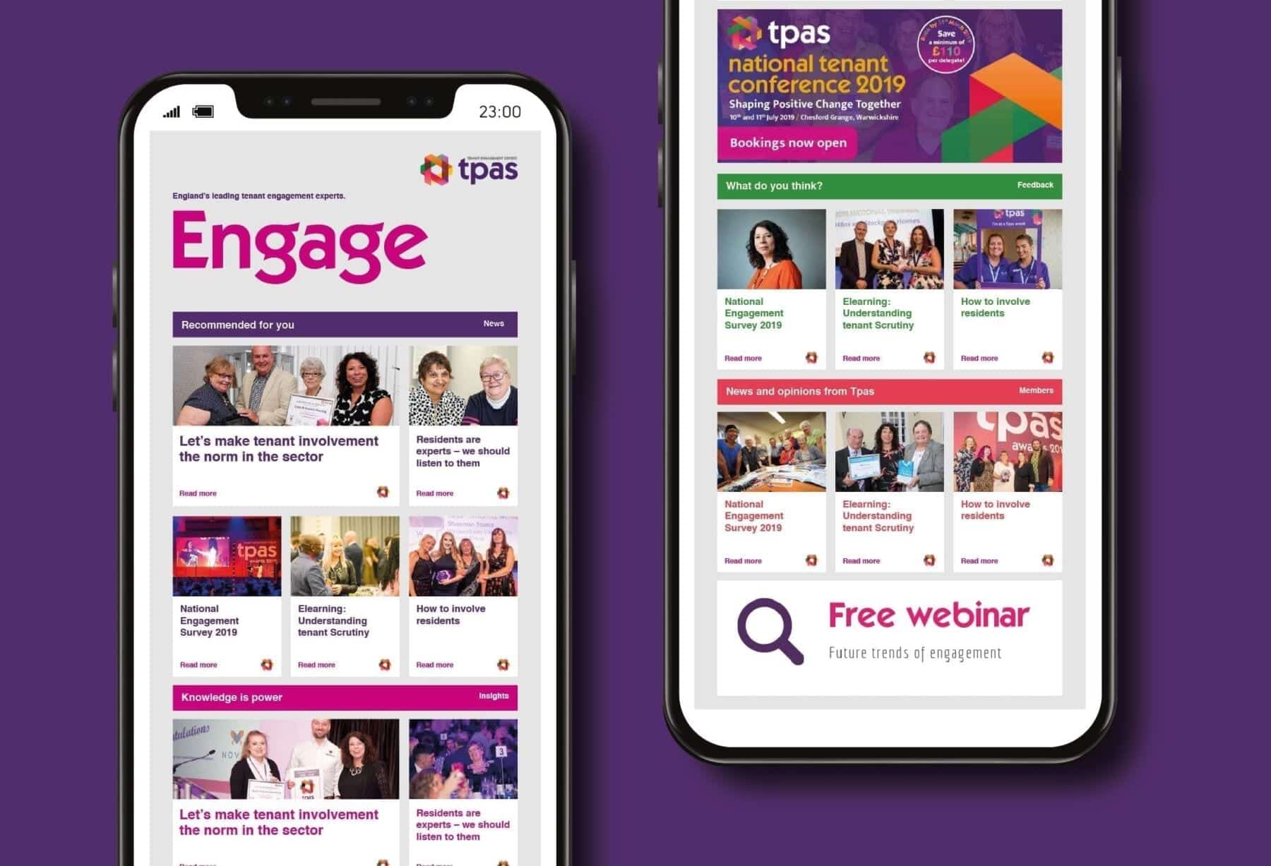
We went beyond the image, working with the team to create a Tpas tone of voice and consistent approach to messaging.
One problem we identified early in the process was that Tpas had many voices, but they sometimes lacked consistency.
We were able to work with the team to develop one common voice which delivered much stronger messages.